ALCHEMY
Science for your skin
Alchemy is a skincare brand focused on creating products that are clean and natural using ayurvedic formulations. As a brand they are also gender neutral as an attempt to support inclusion. In light of using natural ingredients their products are also segregated into collections such as Elements, Aura and Potions, each having a different look and feel.
FINAL LOGO
![alchemy logo.png](https://static.wixstatic.com/media/0a9db7_03f70c209ecb489c99e56dc0fe3afb97~mv2.png/v1/fill/w_402,h_131,al_c,q_85,usm_0.66_1.00_0.01,enc_avif,quality_auto/alchemy%20logo.png)
![LOGO](https://static.wixstatic.com/media/0a9db7_2f7db452eb9d4661b9016d9915e96b36~mv2.jpg/v1/crop/x_0,y_171,w_2151,h_1980/fill/w_169,h_156,al_c,q_80,usm_0.66_1.00_0.01,enc_avif,quality_auto/alchemy%20logo-02.jpg)
- Logo
- Monogram
The logo was designed amalgamating a clean typeface with a symbol created representing the idea of 'alchemy' i.e. the magical process of chemistry and combinations.
PACKAGING DESIGN
![](https://static.wixstatic.com/media/0a9db7_99da7ea201cb414bbd887cf7e2f919c1~mv2.jpeg/v1/fill/w_768,h_1024,al_c,q_85,enc_avif,quality_auto/0a9db7_99da7ea201cb414bbd887cf7e2f919c1~mv2.jpeg)
![](https://static.wixstatic.com/media/0a9db7_dc8c8a07fd5b4d539a2d68c8b1226e25~mv2.jpeg/v1/fill/w_683,h_1024,al_c,q_85,enc_avif,quality_auto/0a9db7_dc8c8a07fd5b4d539a2d68c8b1226e25~mv2.jpeg)
![](https://static.wixstatic.com/media/0a9db7_bfc8a55f49f3415c837af0a6db812aaf~mv2.jpeg/v1/fill/w_768,h_1024,al_c,q_85,enc_avif,quality_auto/0a9db7_bfc8a55f49f3415c837af0a6db812aaf~mv2.jpeg)
![](https://static.wixstatic.com/media/0a9db7_99da7ea201cb414bbd887cf7e2f919c1~mv2.jpeg/v1/fill/w_768,h_1024,al_c,q_85,enc_avif,quality_auto/0a9db7_99da7ea201cb414bbd887cf7e2f919c1~mv2.jpeg)
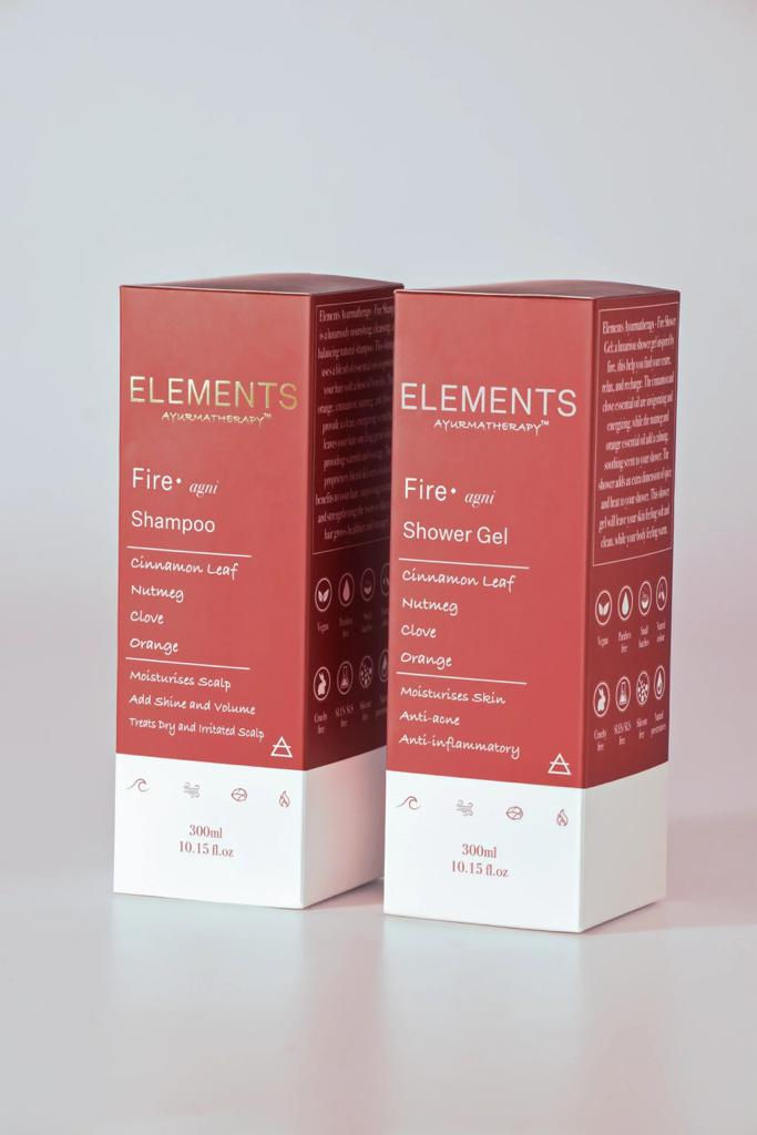
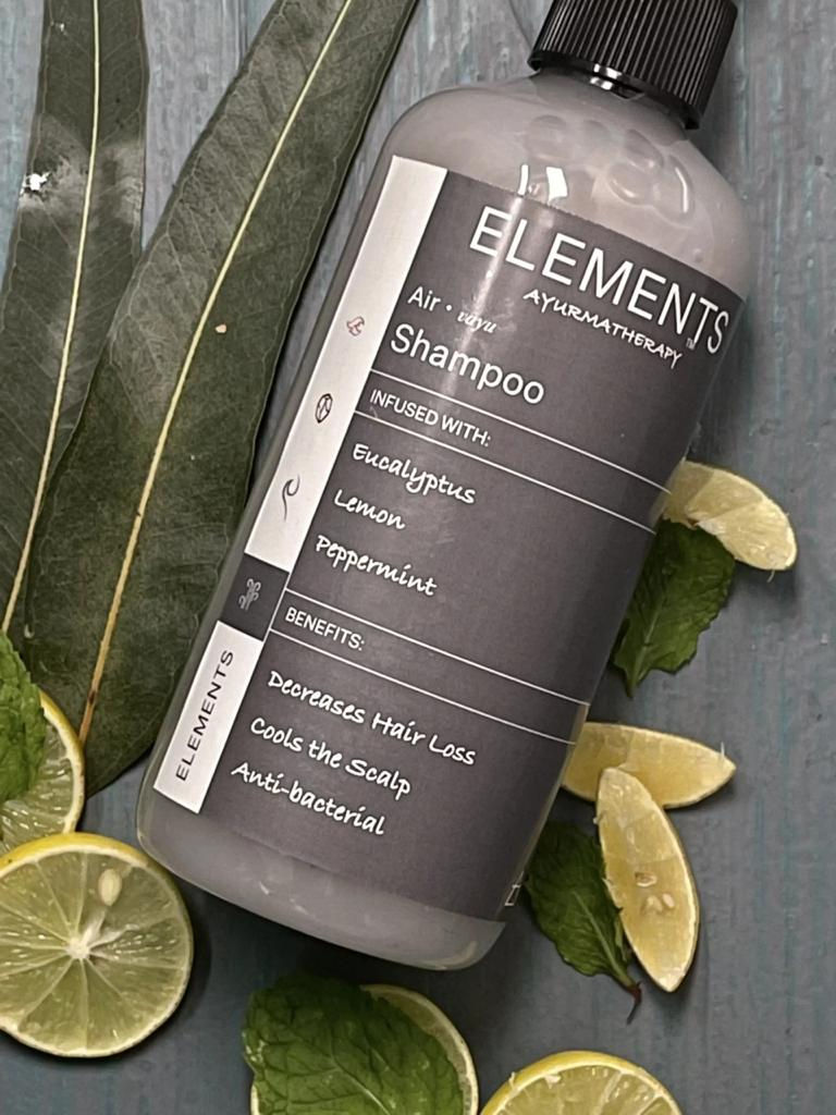
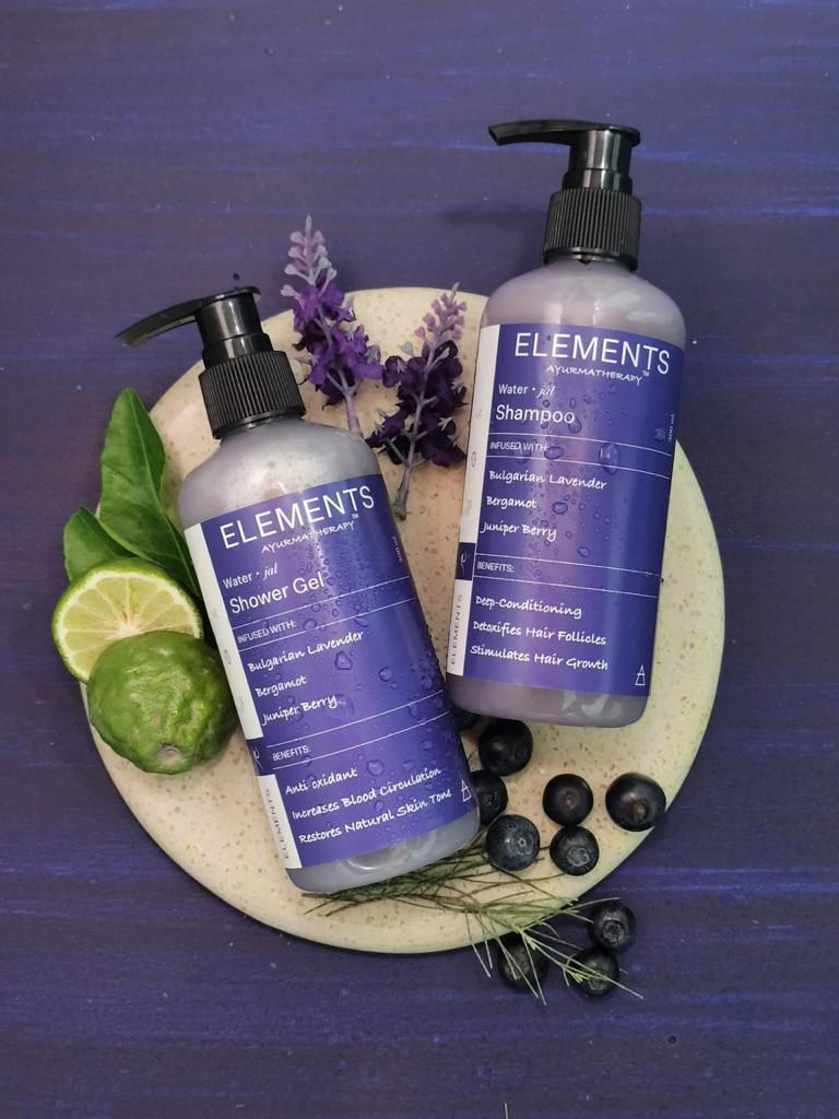
The packaging for their collection 'Elements' was designed around complete transparency in terms of the ingredients used. We went for a prescription like look for the same in keeping with their tagline 'Science for the skin'.
![](https://static.wixstatic.com/media/0a9db7_ee05c8b8b477466d8a8a551421857994~mv2.jpg/v1/fill/w_980,h_735,al_c,q_85,usm_0.66_1.00_0.01,enc_avif,quality_auto/0a9db7_ee05c8b8b477466d8a8a551421857994~mv2.jpg)
![](https://static.wixstatic.com/media/0a9db7_b8ea4a0406524c1ab1e4df117844e9b1~mv2.jpeg/v1/fill/w_980,h_711,al_c,q_85,usm_0.66_1.00_0.01,enc_avif,quality_auto/0a9db7_b8ea4a0406524c1ab1e4df117844e9b1~mv2.jpeg)
![](https://static.wixstatic.com/media/0a9db7_ee05c8b8b477466d8a8a551421857994~mv2.jpg/v1/fill/w_980,h_735,al_c,q_85,usm_0.66_1.00_0.01,enc_avif,quality_auto/0a9db7_ee05c8b8b477466d8a8a551421857994~mv2.jpg)
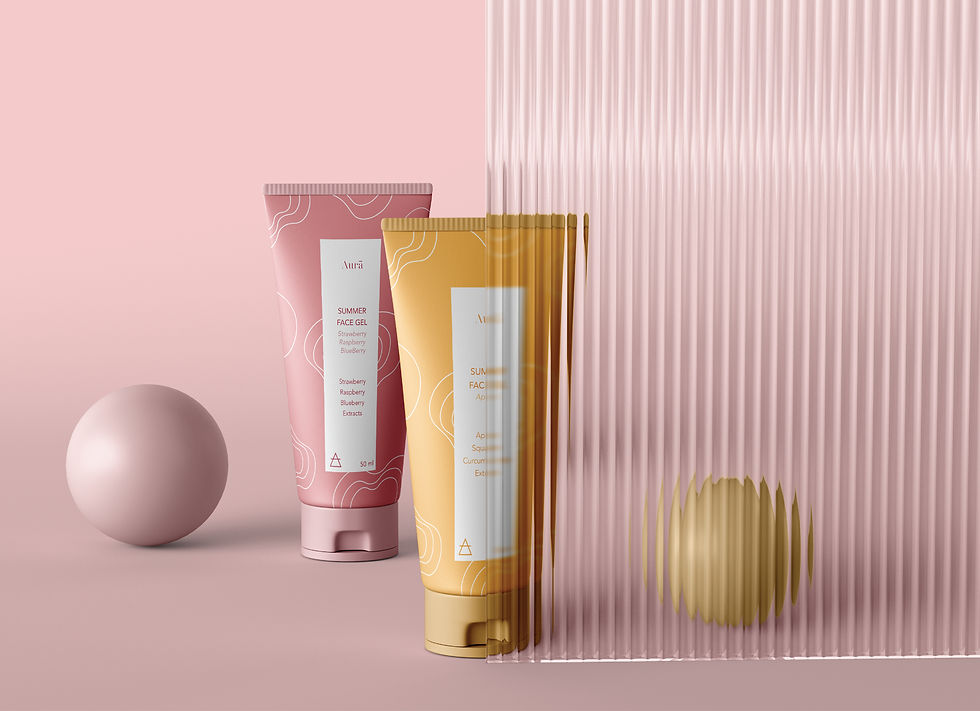
The packaging for their collection 'Aura' was designed around creating an abstraction of a calming environment. Hence, we created elements to go onto their bottles/ labels that would represent the same.
![m 1.jpg](https://static.wixstatic.com/media/0a9db7_79910cef8446479c9af69a58089e7635~mv2.jpg/v1/fill/w_607,h_405,al_c,q_80,usm_0.66_1.00_0.01,enc_avif,quality_auto/m%201.jpg)
The packaging for their collection 'Potions' was designed to exude science. We even created a sub-identity within the name Potions, to represent molecules.